Tabs (container panel)
Add a container panel with a tabs layout when a page has more panels than fit at once and readers should switch between related views.
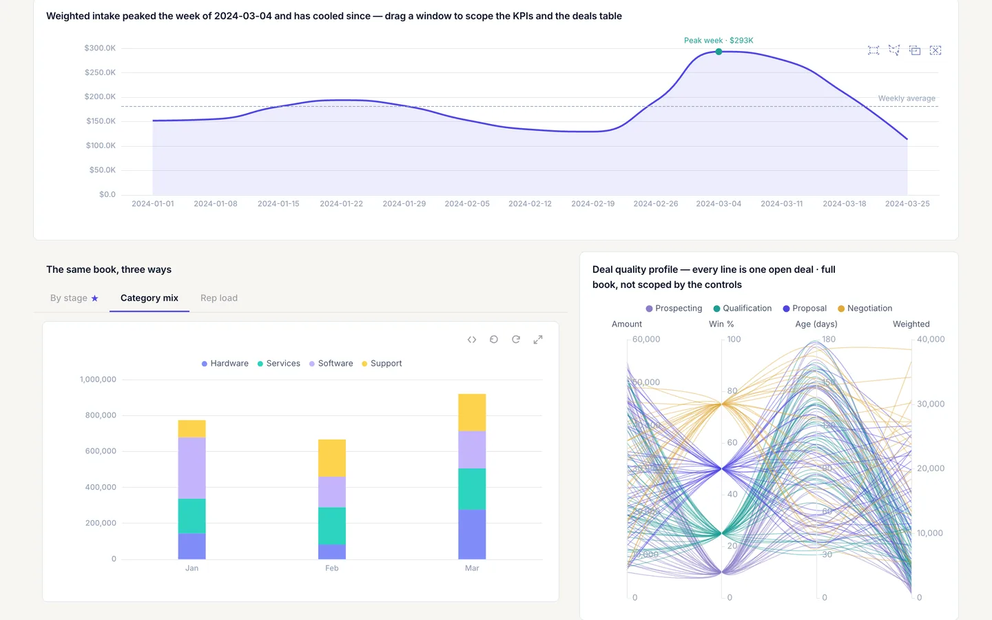
What you can do
- A
containerpanel withspec.layout: tabsshows one tab's panels at a time. spec.tabsis an array of up to 24 tabs; each requiresid,label, andpanels(panel ids, up to 50 per tab), with an optional per-tablayout.defaultTabnames the tab id opened first.- Panels inside a tab keep every interaction:
onClick,contextMenu, and filter targeting all work normally. - A
containerpanel cannot carryonClickof its own.
container is a layout panel; it groups other panels and does not read data itself.
Spec
View spec
{
  "id": "views",
  "type": "container",
  "title": "Pipeline views",
  "spec": {
    "layout": "tabs",
    "defaultTab": "by-stage",
    "tabs": [
      {
        "id": "by-stage",
        "label": "By stage",
        "panels": [
          "stage-funnel",
          "stage-table"
        ]
      },
      {
        "id": "by-rep",
        "label": "By rep",
        "panels": [
          "rep-bars"
        ]
      }
    ]
  }
}
defaultTab opens by-stage first; switching to by-rep swaps in rep-bars without navigating to a different page.
Try it live
Open the pipeline-control-room dashboard in the live demo
Open pipeline-control-room and switch tabs to see the by-stage and by-rep panel sets swap. The screenshot on this page uses a custom light theme, so colors will differ from the template as shipped.
Build it in dvt
Every interaction on this site is a few lines of the same declarative JSON spec. Read the full spec format, or connect an AI agent to your warehouse and build one live in the quickstart.
Follow the build
dvt is in founding research. Leave your email and we'll reach out when there's something to see — no newsletters, no noise.